Your course content is strong. Your thumbnail looks like every other course on the marketplace. That gap is costing you clicks — and enrollments. This guide walks through exactly how to use AI images for online course creators to produce slides and thumbnails that look custom-made without hiring a designer or paying for stock photo subscriptions.
Quick answer: Describe your ideal image in plain English on ATXP Pics, pay a few cents per image, and get a polished result in seconds — no subscription, no design software, no recurring charge. For course creators who need 10–30 images per launch, that's often under $3 total.
Why Course Thumbnails Look Generic (And How to Fix It)
Most course thumbnails look the same because creators are all pulling from the same stock photo libraries — or using the same three Canva template layouts with royalty-free images baked in. Potential students scroll past them without registering what the course is even about.
The fix isn't better design skills. It's more specific imagery. A thumbnail built around a concrete visual idea — one that reflects your course topic, your color palette, and your audience — outperforms a polished-but-forgettable stock image every time.
AI image generation hands you that specificity. Instead of filtering through 400 mediocre stock photos, you describe the exact scene you want and receive it in seconds.
How to Write Prompts That Produce Usable Course Images
The difference between a generic result and a great one is almost entirely in the prompt. Vague prompts produce vague images. Specific prompts produce images that feel intentional.
Use this three-part structure for every prompt:
- Subject — who or what is in the image, described precisely
- Setting and mood — environment, lighting, color palette
- Style or framing — photorealistic, flat illustration, wide banner, close-up, etc.
Prompt template for a course thumbnail
"A confident woman in her early 40s standing in front of a minimalist home office setup, warm afternoon light, soft shadows, muted earth tones — terracotta, cream, and sage green. She's looking directly at the camera with a calm, authoritative expression. Photorealistic, wide 16:9 banner composition."
Compare that to "a woman working from home." Same subject. Completely different output.
Prompt template for a slide illustration
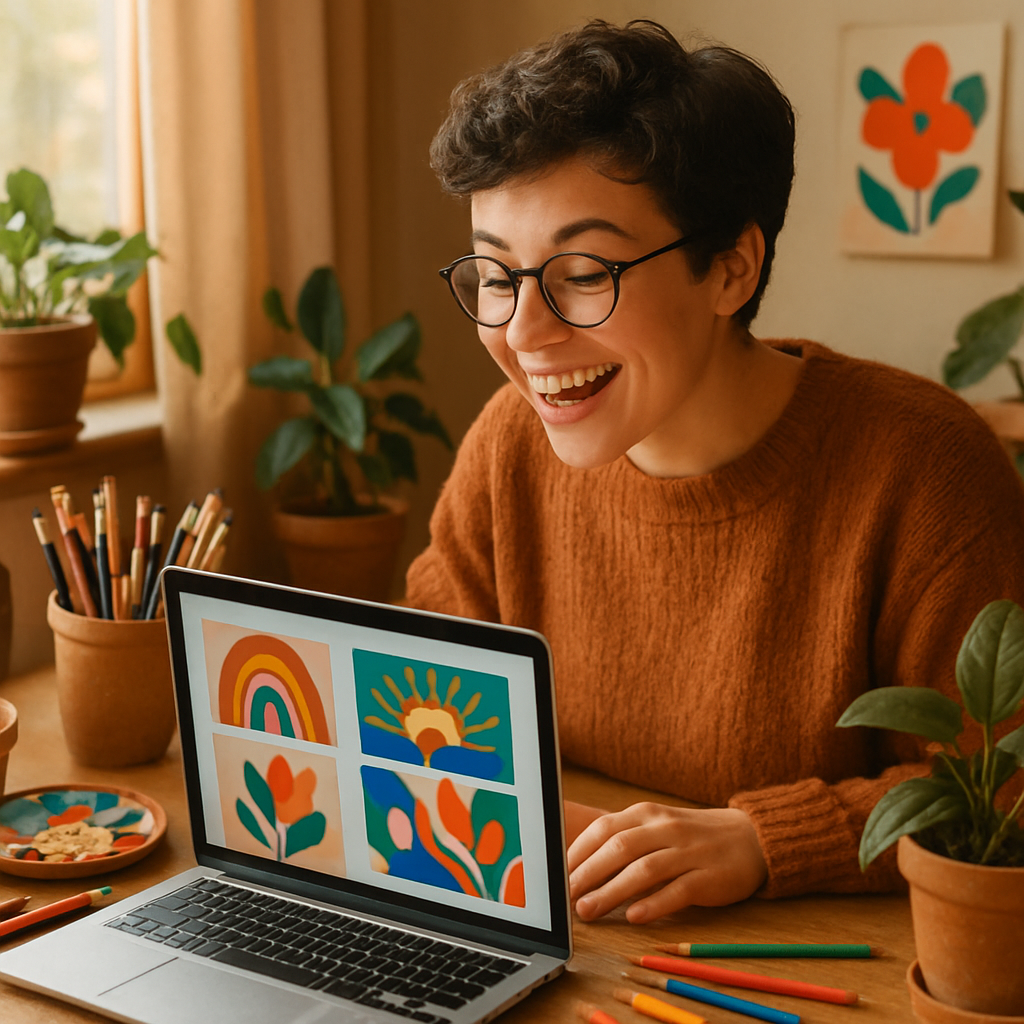
"Flat vector-style illustration of a simple funnel diagram — wide at the top, narrow at the bottom — in a limited palette of navy blue and warm yellow on a white background. Clean, modern, no gradients. Suitable for a business course slide."
Slide illustrations don't need to be photorealistic. Flat, icon-adjacent styles often read better at small sizes inside a slide deck.
Prompt template for a module cover image
"Overhead shot of a wooden desk with an open notebook, a cup of coffee, and a pen. Natural light from the left, soft shadows. Neutral tones — white, light grey, warm wood. Minimal and clean. Photorealistic."
Module cover images can be simple. Consistent lighting and color palette across all of them makes the course feel professionally produced.
Step-by-Step: Producing a Full Course Image Set
Here's a repeatable workflow for generating images across an entire course launch:
- List every image you need before generating anything. Typical course image set: 1 hero thumbnail, 5–8 module covers, 10–15 slide illustrations, 2–3 promotional social banners.
- Pick a visual style and palette and keep it consistent. Decide upfront: photorealistic or illustrated? Warm tones or cool? This becomes part of every prompt you write.
- Write your prompts in a doc before you generate. Reusing your style language across prompts keeps results cohesive.
- Generate in batches. Start with your thumbnail — it's the highest-stakes image. Refine the prompt until the result looks right, then use that prompt's style language as a baseline for everything else.
- Drop images directly into your course platform. ATXP Pics delivers finished images you can upload immediately to Teachable, Thinkific, Kajabi, or any slide tool.
Generate your first course image →
What to Avoid When Generating Course Images
The most common mistake is prompting for too much. Crowded images — too many objects, too much going on — look cluttered at thumbnail size and confuse the viewer.
- Avoid text in AI images. AI-generated text is still unreliable. Add any course title or headline in Canva or your slide editor after you generate the image.
- Avoid hyper-specific facial expressions. Prompting for "surprised" or "laughing" often produces uncanny results. Stick to neutral, confident, or calm expressions.
- Avoid over-describing style conflicts. Don't ask for "photorealistic flat illustration minimalist 3D." Pick one visual direction.
- Avoid generating one image and giving up. If the first result is close but not right, adjust one variable at a time — lighting, framing, color — rather than rewriting the whole prompt.
What This Costs Compared to Stock Photos or a Designer
Pay-per-image pricing makes AI generation dramatically cheaper than the alternatives for a course creator who needs a few dozen images per launch.
| Option | Typical cost | Recurring? | |---|---|---| | Stock photo subscription (Shutterstock, Getty) | $29–$49/month | Yes — charged even when you don't create | | Freelance designer (thumbnail + 10 images) | $150–$400 per project | Per project | | Canva Pro (templates only, still stock images) | $15/month | Yes | | ATXP Pics (pay-per-image) | A few cents per image | No subscription, balance never expires |
A full course image set — thumbnail, 8 module covers, 15 slide illustrations — might run 24 images. At a few cents each, that's typically under $3. No monthly commitment. No renewal to cancel.
If you're launching once or twice a year, a subscription-based tool is charging you for 10–11 months you're not actively creating. Pay-per-image only charges you for what you actually generate.
Getting Consistent Results Across a Full Course
Consistency is what separates a professional-looking course from a DIY one. If your thumbnail uses warm earth tones and your module covers use cold blue-grey stock photos, the course feels cobbled together even if each image is fine on its own.
The fix is a simple style guide you apply to every prompt:
Example style guide for a business productivity course: Color palette: warm cream, terracotta, forest green Style: photorealistic Lighting: soft, natural, slightly warm Mood: calm, focused, professional Framing: clean and uncluttered, minimal props
Paste this into the beginning of every prompt you write and adjust only the subject. Your images will look like a coordinated set rather than a random collection.
Course creators don't need a design budget or a stock photo subscription to produce images that look intentional and on-brand. A clear prompt, a consistent style guide, and pay-per-image pricing are all you need to generate a complete course image set in an afternoon.