Your real estate brand is judged before anyone walks through a door. A prospect sees your yard sign, your email signature, or your social profile — and decides in seconds whether you look like an agent worth calling. An AI logo for a real estate company lets you generate professional visual concepts in minutes, without waiting weeks for a designer or committing to a brand identity you haven't tested yet.
Quick answer: Type a plain-English description of the logo you want — style, colors, symbol, and business name — and ATXP Pics returns a high-quality logo concept in seconds. No subscription, no design skills, no software. Pay a few cents per image and generate as many variations as you need until something clicks.
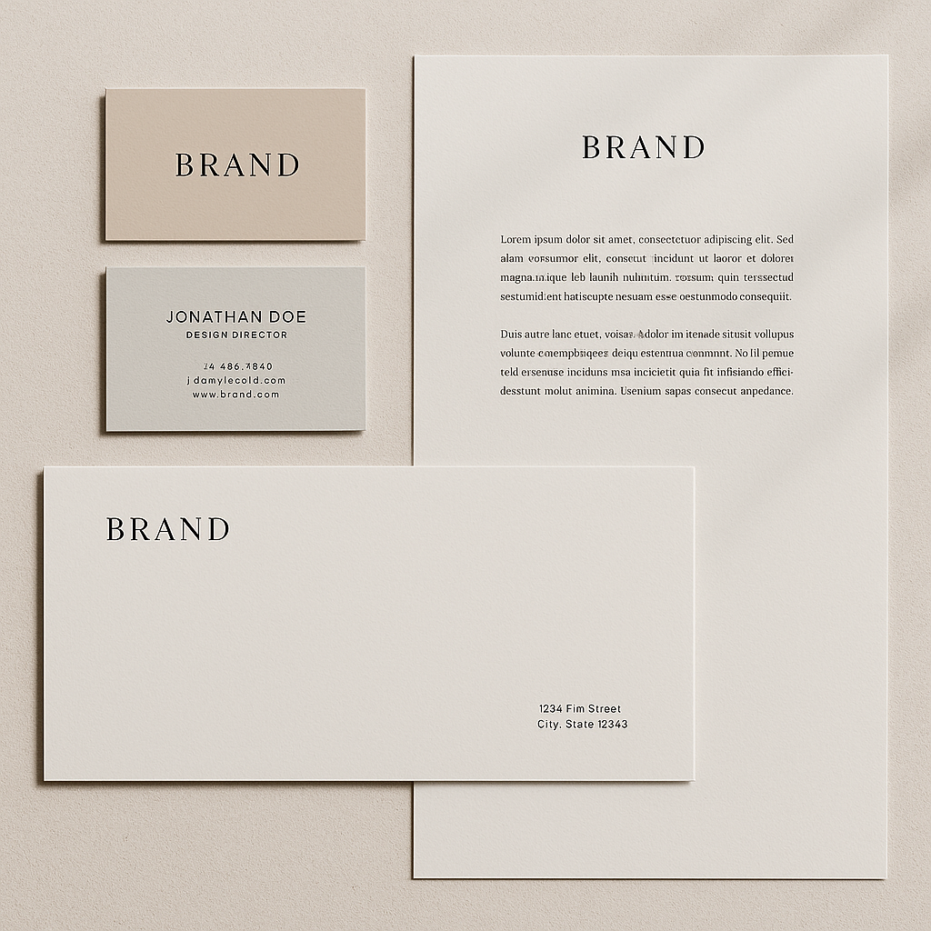
What Makes a Real Estate Logo Work
A real estate logo earns trust before a single conversation happens. It needs to feel established without being stuffy, and approachable without being generic. Three elements carry most of the weight:
- Symbol — a roofline, an arch, a key, a door, or a clean abstract mark signals the industry without spelling it out
- Typography — serif fonts read as established and authoritative; clean sans-serifs read as modern and direct
- Color — navy, forest green, deep burgundy, and warm gold are the workhorses of real estate branding because they signal stability and value
The mistake most new agents make is reaching for the same clip-art house icon every competitor uses. Your prompt is where you escape that.
How to Write a Logo Prompt That Gets Real Results
The more specific your prompt, the closer the first result lands. Vague prompts produce generic output. Treat your prompt like a brief you'd hand a designer — include the business name, the visual idea, the mood, and the color direction.
Prompt structure to follow
- Start with the format — "Logo design concept for..."
- Name the business — include it exactly as you want it to appear
- Describe the symbol — be specific about the shape or icon
- Specify the style — minimalist, classic, modern, luxury, approachable
- Name the colors — use real color names, not just "professional colors"
- Add the mood — trustworthy, boutique, bold, community-focused
Example prompts to copy
Logo design concept for "Harlow & Reed Realty" — minimal roofline icon, clean serif wordmark, deep navy and warm gold, luxury residential feel, white background, no gradients
Logo concept for "Sunrise Properties" — abstract sunrise over a simple house silhouette, modern sans-serif type, terracotta and warm white color palette, friendly and community-focused, flat design
Monogram logo for real estate agent "M. Chen" — letterform M integrated with a subtle arch or door shape, charcoal and gold, sophisticated and minimal, scalable mark
Run each of these as written, then tweak one variable at a time — swap the colors, change "roofline" to "key," shift from serif to sans-serif — and you'll have a range of distinct directions in under ten minutes.
Step-by-Step: From Blank Page to Logo Concept
- Write down three adjectives that describe how you want clients to feel when they see your brand. (Established? Approachable? Boutique? Bold?) These become your prompt's mood language.
- Pick one visual direction to start — symbol-based, monogram, or wordmark-only. Don't try to combine all three in your first prompt.
- Draft your first prompt using the structure above. Keep it under 40 words.
- Generate 3–4 variations of that prompt on ATXP Pics →, changing one element between each run.
- Compare the results side by side. Look for which one reads well at small sizes — that's what will appear on a yard sign or email footer.
- Run a second round on the direction that resonates, tightening colors and typography language based on what you saw.
- Save your favorites and bring them to a designer for vectorization, or test them directly in mockups before committing.
What to Avoid in Your Prompts
Overly complex prompts produce cluttered logos that don't scale. A few patterns to skip:
- Stacking multiple symbols — "a house, a key, and a tree" in one mark creates noise, not identity
- Vague mood words without visual direction — "professional and modern" alone gives the generator nothing to work with
- Asking for gradients — gradient logos rarely hold up on printed materials; specify "flat design" or "solid colors"
- Skipping the business name — if your name needs to appear in the logo, include it in the prompt or the result won't reflect it
Common mistake: the generic house icon
Every real estate logo generator default produces a triangle-roof-over-a-square house. If that's what you want, you'll get it. If you want something that stands out, push past it in your prompt: "avoid generic house icon," "abstract architectural mark," or "letterform-based symbol only."
Cost: What AI Logo Generation Actually Runs
On ATXP Pics, you pay per image — a few cents each, with no subscription and no balance expiration. Contrast that with what logo work typically costs:
| Option | Cost | Time | Flexibility | |---|---|---|---| | Freelance designer (logo only) | $300–$1,500+ | 1–3 weeks | Revisions limited by contract | | Logo template platforms | $20–$50/month subscription | Minutes | Generic, widely used templates | | ATXP Pics (concept generation) | Cents per image | Seconds | Unlimited variations, no commitment |
For an agent testing a new brand, or a broker launching a boutique firm, generating 20–30 concepts to find a clear direction costs less than a single business card order. Once you know the direction, a designer can vectorize and finalize it — and you arrive with a clear brief instead of a blank canvas.
Generate your real estate logo concept →
When to Take an AI Concept Further
An AI-generated logo concept is a starting point, not always a finish line. Here's how to read the situation:
- Use it as-is for social profiles, email signatures, and digital ads while you test the brand
- Take it to a designer when you're ready to go to print — they'll vectorize it, create variations (horizontal, stacked, icon-only), and deliver print-ready files
- Use multiple concepts as a mood board to brief a designer, saving hours of back-and-forth on direction
The agents who get the most out of this process generate broadly first — five different visual directions — then narrow hard. You'll know the right direction when you see it at thumbnail size and it still reads clearly.
Your logo is the first signal a prospect receives about whether you're worth their time. Spending a few cents to generate a dozen strong concepts — and arriving at your brand identity with intention — is one of the highest-return things you can do before your next listing goes live.