You're launching a tech startup and you need a logo that won't embarrass you in a pitch deck or on a VC's second monitor. This guide walks you through exactly how to generate an AI logo for a tech startup that looks intentional, scales cleanly, and signals credibility before you say a word.
Quick answer: Describe your startup's core function, target audience, and visual tone in a single clear sentence, then specify format (icon, wordmark, or combination mark), color palette, and what to avoid. Generate 10–20 variations, pick the strongest direction, and refine from there. The whole process takes under 30 minutes and costs a few cents per image — no subscription needed.
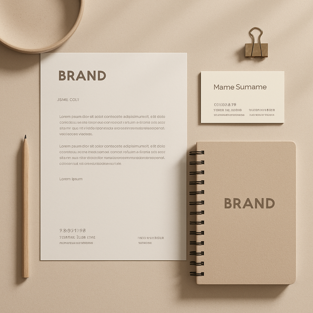
What Makes a Tech Startup Logo Different
A tech startup logo needs to do more work than most. It has to read well at 16×16 pixels as a favicon, fill a 6-foot conference banner without pixelating, and look sharp in grayscale on a printed term sheet. That's a stricter set of constraints than, say, a restaurant logo.
The three non-negotiables for a startup logo:
- Simplicity — one strong idea, not five competing ones
- Scalability — clean lines and minimal detail that hold up at any size
- Flexibility — works in color, monochrome, and reversed (white on dark)
Trendy effects — drop shadows, intricate gradients, 3D bevels — fail all three tests. When you're writing your prompt, restraint is your best creative decision.
How to Write a Logo Prompt That Actually Works
The quality of your logo comes directly from the quality of your prompt. Vague inputs ("make a tech logo") produce vague outputs. Specific inputs produce options you can actually use.
Structure your prompt in four parts
- What your startup does — one concrete sentence, no buzzwords
- The visual concept — an icon, a lettermark, an abstract symbol, or a wordmark
- Color palette — two or three specific colors, or a mood (cool blues, neutral grays, bold single color)
- What to exclude — this is where most people leave value on the table
Prompt examples you can copy and adapt
"Minimal logo concept for a B2B SaaS company that helps logistics teams track shipments in real time. Icon-only mark using a simplified arrow or path symbol. Dark navy and white. No gradients, no drop shadows, no 3D effects. Clean enough to work as a favicon."
"Wordmark logo for a cybersecurity startup targeting enterprise clients. Geometric sans-serif typeface, single color, slate gray or electric blue. Conveys trust and precision. No shield clichés."
"Combination mark — icon plus name — for an AI-powered recruiting platform. Abstract symbol suggesting connection or matching. Monochrome-ready. Modern but not playful. Avoid people silhouettes."
Notice the pattern: function → format → color → exclusions. Every detail you add removes a degree of ambiguity and narrows the output toward something usable.
Step-by-Step: Generating Your Startup Logo
Follow this sequence to go from blank page to a strong logo candidate in under 30 minutes.
-
Write your brief first. Before you touch any tool, write two sentences: what your company does and what feeling the logo should create. This becomes the spine of every prompt you generate.
-
Generate a broad first round. Run 5–8 prompts covering different directions — icon-only, wordmark, abstract mark. Vary the color direction and tone (minimal vs. bold, technical vs. approachable). At a few cents per image, exploring costs almost nothing.
-
Identify the strongest direction. Don't try to combine your three favorites into one logo. Pick the single concept that best matches your brand positioning and double down on it.
-
Refine with tighter prompts. Once you have a direction, narrow your prompts to that specific style. Adjust color, weight, and composition in each iteration.
-
Test for scalability. Take your top candidate and mentally shrink it: would it still read as a clear shape at thumbnail size? If the answer is no, simplify further.
-
Test in context. Drop the concept into a mock pitch deck slide or a white background with your company name in a clean typeface. Context reveals problems that isolated review misses.
Generate your first logo concepts →
Common Mistakes to Avoid
Most first-time logo prompts fail the same three ways.
Being too abstract
Prompts like "something that feels innovative" give the generator no constraints. The output will be random. Ground every prompt in at least one concrete visual element — a shape, a symbol category, or a composition type.
Asking for too much in one logo
A startup logo that tries to communicate speed, security, intelligence, and global reach simultaneously communicates nothing. Pick the one thing that matters most and let the logo express that cleanly.
Skipping the exclusion list
Without explicit exclusions, you'll get the same shield-and-circuit-board clichés that crowd the tech logo space. Tell the generator what not to do. Common exclusions for tech logos:
- No circuit board patterns
- No globe or world map elements
- No gradient fills
- No shield or lock icons (unless you're in security and want to lean into it deliberately)
- No humanoid figures or hands
Choosing complexity over clarity
Intricate logos look impressive in a high-res preview and fall apart everywhere else. If you can't describe the logo shape in one sentence, it's too complex.
What "Investor-Ready" Actually Means
Investor-ready means the logo doesn't become a distraction. When a VC opens your pitch deck, you want their attention on your market opportunity — not a clipart-feeling icon or a logo that screams "made in a weekend."
Three quick checks:
- Monochrome test: Print the logo in black and white. Does it still look intentional?
- Favicon test: Shrink it to 32×32 pixels. Is the core shape still recognizable?
- Context test: Place it on a slide with other professional logos (competitors, partners). Does it hold its own visually?
A logo that passes all three is investor-ready. You don't need a $5,000 branding agency for that — you need a sharp prompt and a few iterations.
Building a startup is expensive enough. Your logo shouldn't require a monthly subscription or a designer retainer to get right. ATXP Pics is pay-per-image — a few cents each, balance never expires, no subscription required. Generate as many concepts as you need, stop when you have what you want.