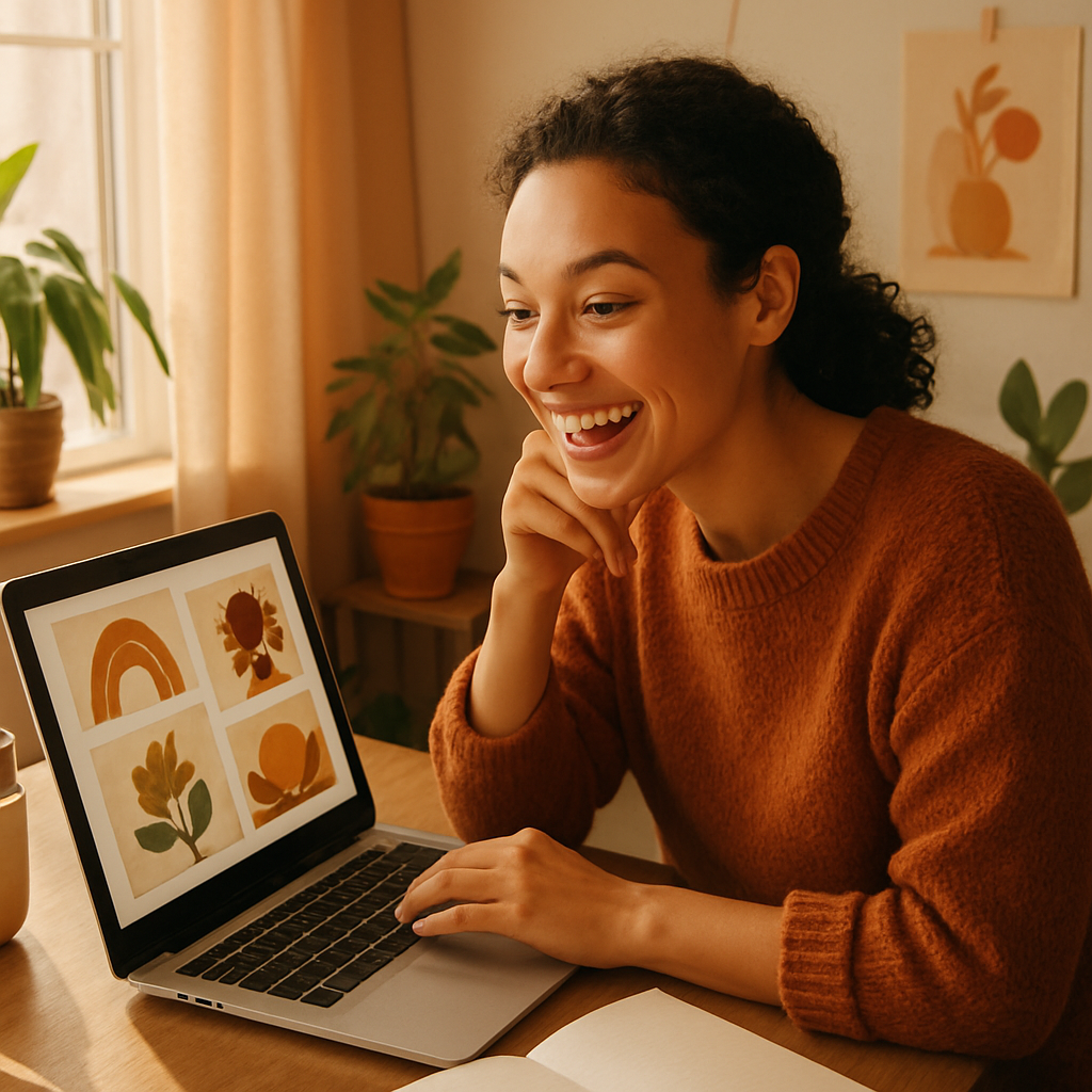
You want that punchy, high-contrast, four-color-panel look — the kind Andy Warhol made iconic — but you're not a graphic designer and you don't have hours to spend in Illustrator. An AI pop art generator gets you there in under a minute. This guide walks you through exactly how to prompt for it, what style references to use, and common mistakes that flatten your results.
Quick answer: To generate pop art with AI, describe your subject and add style keywords like "Andy Warhol screen print, four-panel grid, flat color blocks, high contrast, bold outlines." The more specific your color palette and composition details, the closer the result lands to classic pop art. No subscription or design skills required.
What Makes an Image Look Like Pop Art
Pop art has four defining visual traits that your prompt needs to address directly. Miss any one of them and you get a vaguely colorful illustration instead of the real thing.
- High contrast — dark outlines against flat, saturated fills
- Limited, punchy color palettes — typically 3–5 bold colors, not gradients
- Flat shading — no soft shadows or photorealistic lighting
- Repetition or grid composition — Warhol's signature repeated-panel format
When you write an AI prompt, you're essentially telling the generator which of these traits to prioritize. A generic prompt like "pop art dog" leaves too many decisions to chance. A specific prompt locks in all four traits at once.
How to Write a Pop Art Prompt That Actually Works
The best pop art prompts follow a four-part structure: subject + style reference + color palette + composition.
Here's the template:
[Subject], [named artist] style, [color palette], [composition detail], flat shading, bold outlines, high contrast
Part 1: Name Your Subject Clearly
Be specific. "Woman" is vague. "Close-up portrait of a woman with short hair, facing forward, neutral expression" gives the generator geometry to work with. Pop art lives or dies on strong silhouettes.
Part 2: Use a Named Style Reference
The three most recognizable pop art styles each produce a distinct look:
| Reference | Visual Result | |---|---| | Andy Warhol screen print | Repeated panels, flat color fills, offset printing feel | | Roy Lichtenstein | Ben-Day dots, thick black outlines, comic-book halftones | | Keith Haring | Bold continuous outlines, radiant lines, graphic figures |
Pick one and name it explicitly in your prompt. Mixing all three in one prompt usually produces a muddy middle ground.
Part 3: Specify the Color Palette
Warhol's power came from color choices that were deliberate and unexpected — magenta skin, cyan hair, yellow background. Don't let the AI default to "whatever looks nice." Call out 3–4 specific colors.
Examples that work well:
magenta, cyan, yellow, blackneon orange, electric blue, hot pink, whitelime green, red, purple, black
Part 4: Set the Composition
"Four-panel grid" is the Warhol signature. "Single portrait, centered" works for a cleaner look. "Repeating pattern" produces wallpaper-style tiles. State it explicitly.
Three Ready-to-Copy Pop Art Prompts
Try these directly on ATXP Pics:
Warhol-style portrait:
Close-up portrait of a woman with short hair, Andy Warhol screen print style, four-panel grid, each panel a different flat color background — magenta, cyan, yellow, lime green — flat color fills, bold black outlines, high contrast, no gradients
Lichtenstein comic style:
Young man looking surprised, Roy Lichtenstein comic book style, Ben-Day dot shading, thick black outlines, primary colors only — red, blue, yellow — speech bubble in corner, vintage print texture
Keith Haring object/logo:
Coffee cup with steam, Keith Haring style, bold continuous black outline, radiant lines emanating outward, flat red fill, white background, graphic and simple
Each of these gives the generator a complete brief. Swap in your own subject and adjust the palette to match your project.
Common Mistakes That Kill the Pop Art Effect
The single biggest mistake is letting gradients and soft lighting creep in. AI generators default toward photorealistic lighting unless you explicitly block it.
Add these phrases to any pop art prompt to prevent it:
no gradientsno soft shadowsno photorealistic lightingflat shading only
Three other mistakes worth avoiding:
- Overcrowded scenes — Pop art works on isolated subjects with negative space. A "busy street scene in Warhol style" rarely works well. Simplify to one or two subjects.
- Vague color instructions — "Bright colors" is not a palette. Name the specific colors you want.
- Skipping the composition detail — Without a composition instruction, you'll often get a single centered image when you wanted a grid, or a grid when you wanted a clean single.
What to Use Pop Art Images For
Pop art visuals punch above their weight on social media, merchandise mockups, and event promotion. The bold, high-contrast style reads clearly even at small sizes — which makes it ideal for thumbnails, profile graphics, and print-on-demand products.
Common use cases:
- Social media graphics — Bold enough to stop a scroll. Try the social media image creator for sized outputs.
- Event posters — A band, brand, or birthday party poster in Warhol style is immediately eye-catching.
- Product mockups — Pop-art product shots stand out in crowded category pages. See AI product mockup generator for more on this approach.
- Personalized gifts — A Warhol-style portrait of someone's pet or face makes a memorable print.
Ready to try it? Generate your first pop art image →
No subscription required. You pay only for the images you create — a few cents each — and your balance never expires. Run through five color palette variations on the same portrait for less than the cost of a coffee.
How the Cost Compares
If you're only creating pop art images occasionally — for a project, a gift, an event — a monthly subscription charges you whether you create or not.
| Scenario | Midjourney Basic ($10/mo) | ATXP Pics (pay-per-image) | |---|---|---| | 5 images/month | $2.00 per image | A few cents each | | 20 images/month | $0.50 per image | A few cents each | | 0 images next month | Still charged $10 | $0 |
The math favors pay-per-image for anyone who creates in bursts rather than daily. Generate 10 pop art variations for a project this week, then nothing for two months — you pay only for those 10 images.
Start With One Prompt
Copy any of the three prompts from this guide, swap in your subject, and run it. The four-part structure — subject, style reference, color palette, composition — does most of the heavy lifting. From there it's just a matter of adjusting colors or switching the style reference to get from "close" to "exactly right."
Pop art is one of the most forgiving styles to prompt for because its rules are so visual and explicit. Name what you want, and the generator delivers it.